
Mrs Elswood Kimchi
Packaging Design Case Study
Client
Mrs Elswood
Sector
Food & Drink
Services
Packaging Design
Illustration
Artwork
Deliverables
3x SKUs
Jar Label Designs
Lid Design
Print Artwork
The Brief
Create a distinctive packaging range for three Mrs. Elswood Kimchi variants that would appeal to a younger audience while remaining recognisably to the Mrs. Elswood brand.
The Challenge
Introduce a bold, contemporary design without losing the established brand cues, ensuring clear flavour differentiation and maximum shelf impact.
Brand Exploration
The design process began by identifying the key visual assets that made the Mrs. Elswood brand instantly recognisable. These elements formed the foundation for developing a fresh, more contemporary identity.
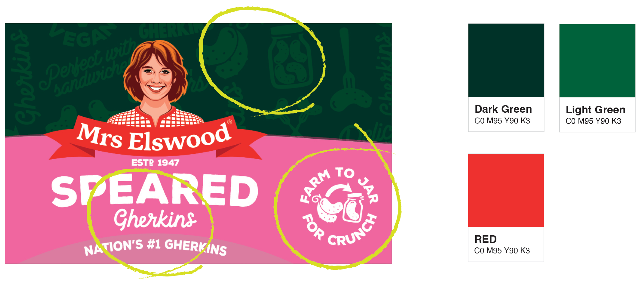
Exploring fonts, colours and illustration.
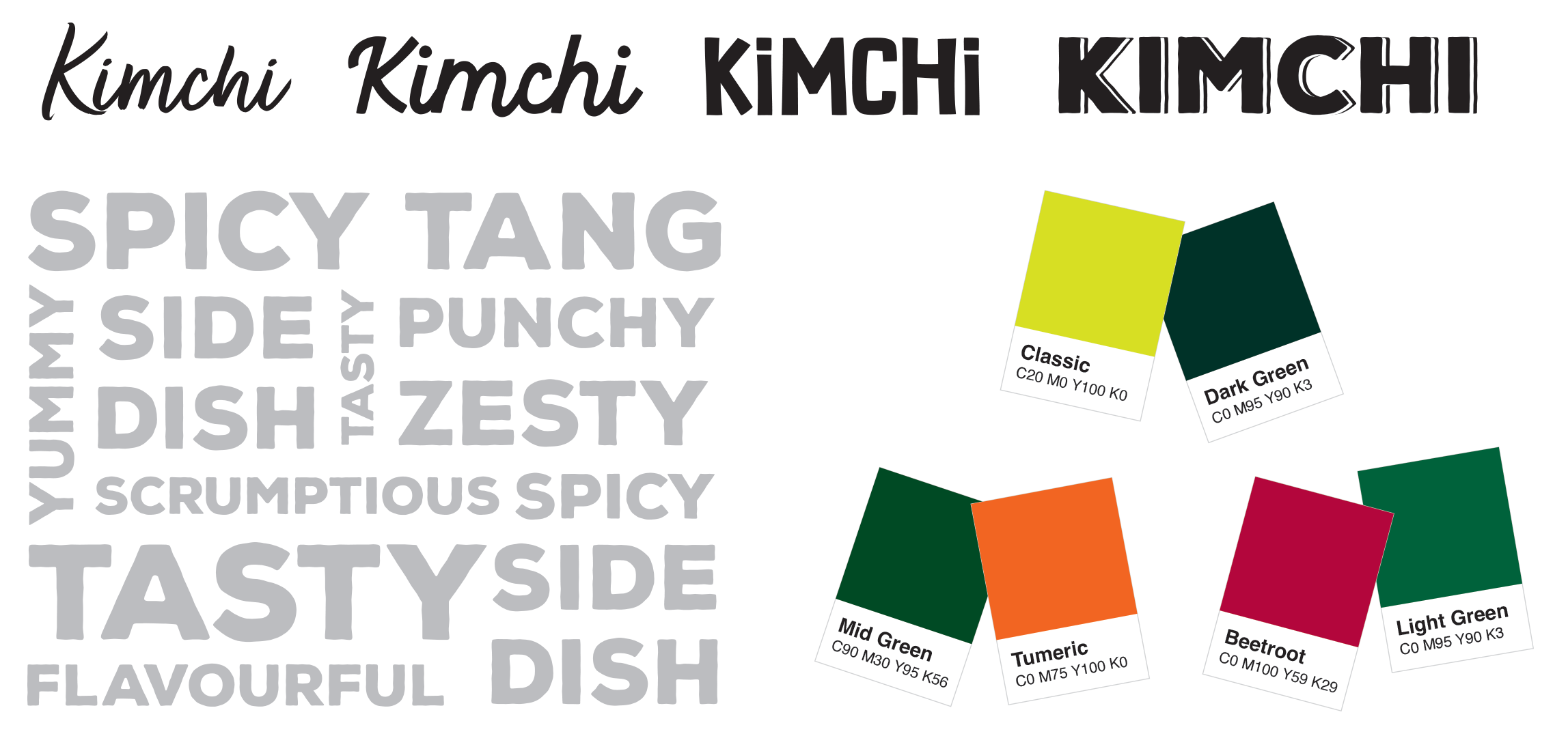
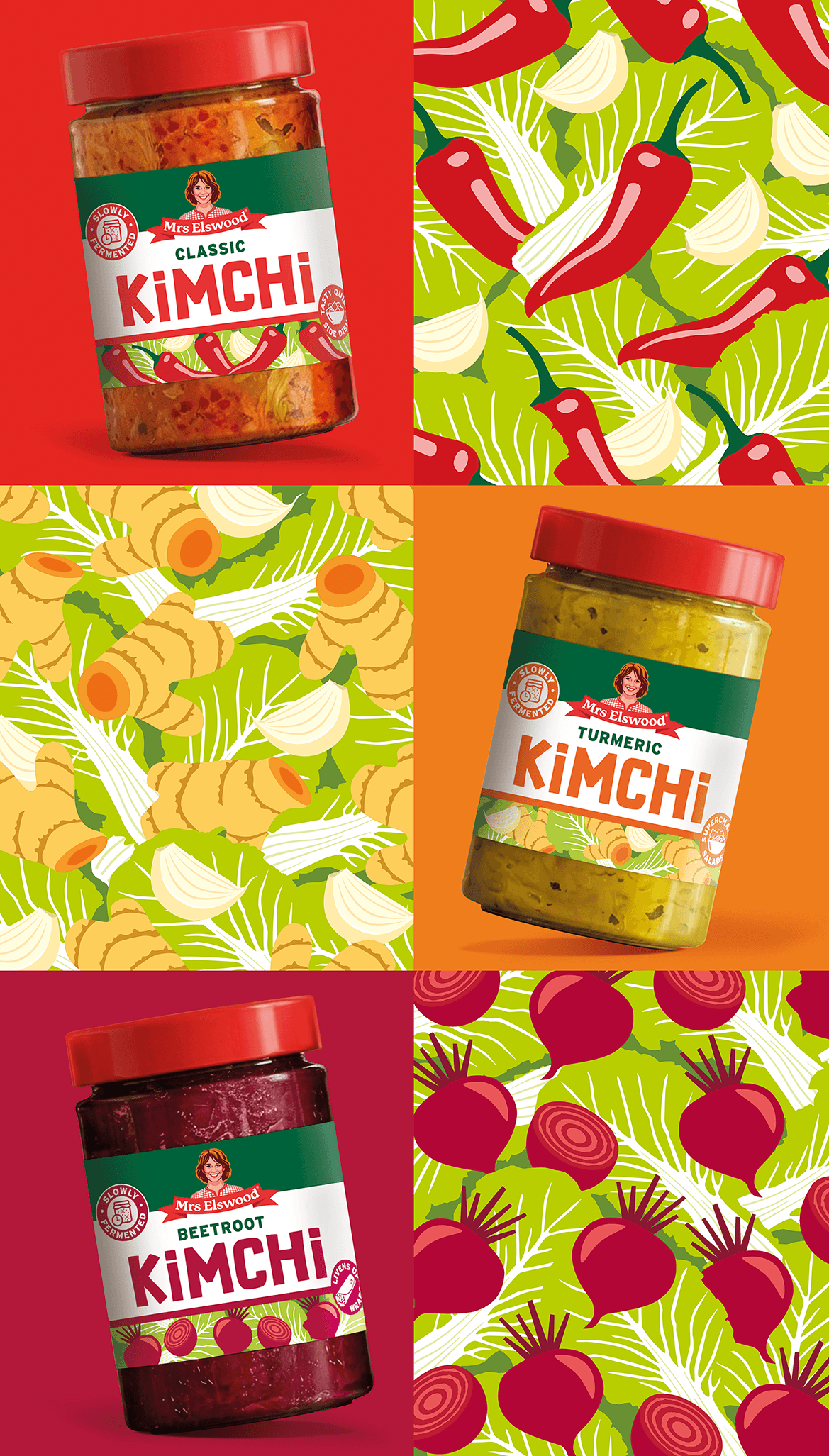
Playful vegetable illustrations were introduced to give each flavour its own personality, create shelf standout and reinforce the fresh, natural ingredients.
Design Options
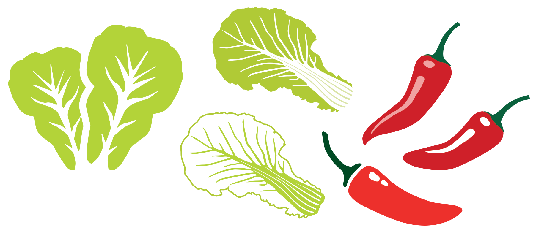
Four creative directions were explored, each experimenting with different approaches to colour, typography and illustration while maintaining the recognisable Mrs. Elswood brand identity.
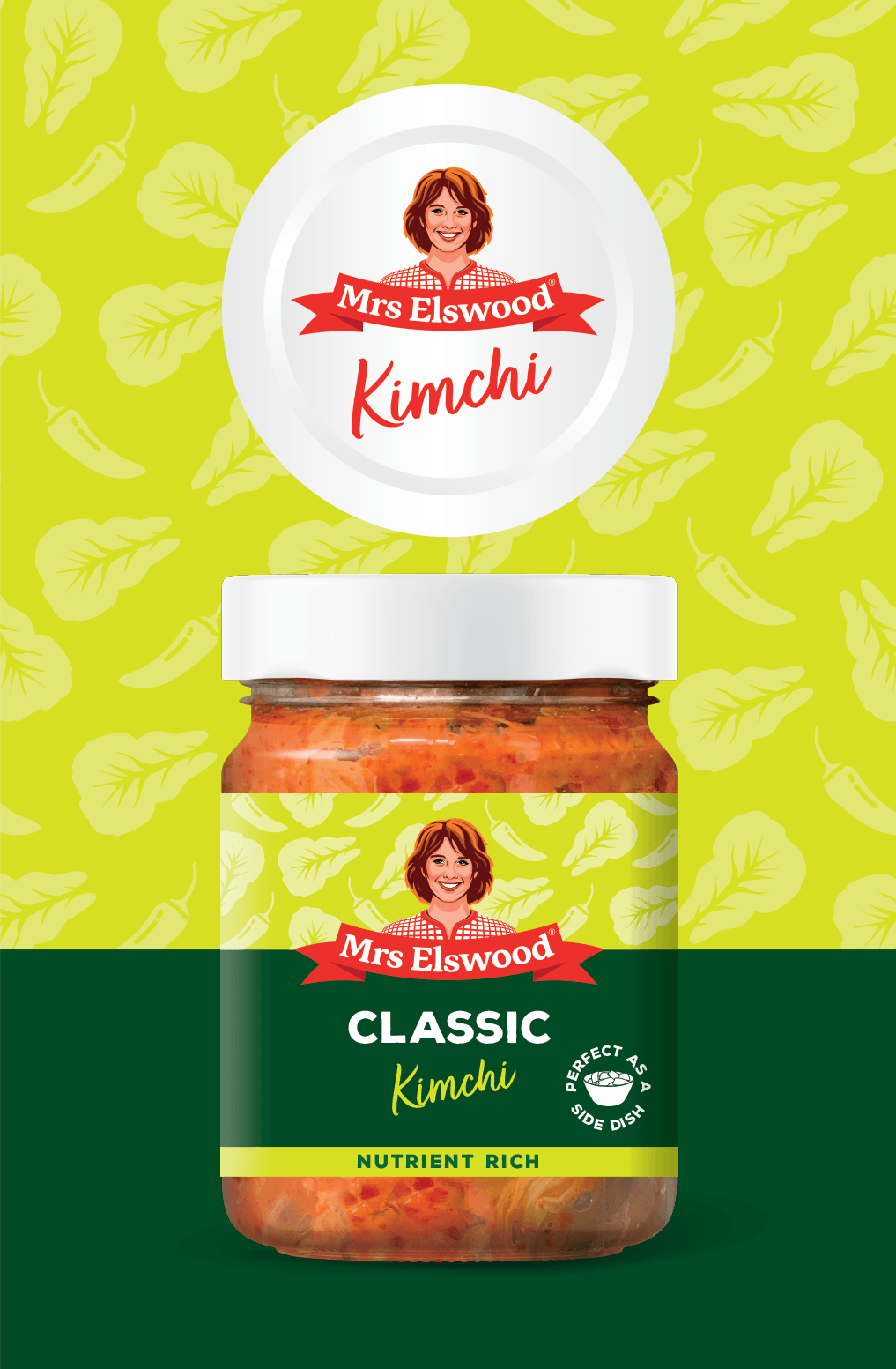
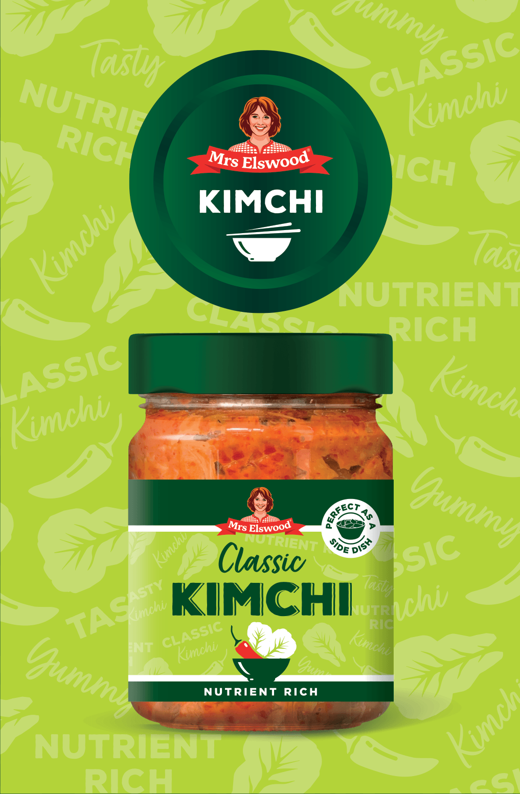
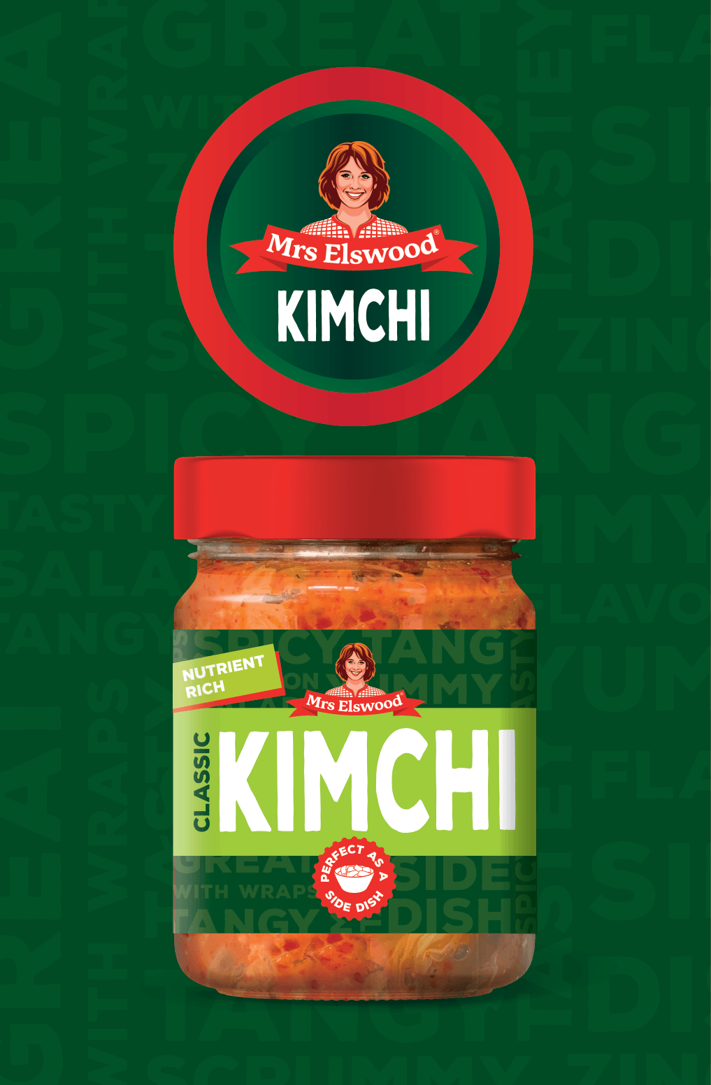
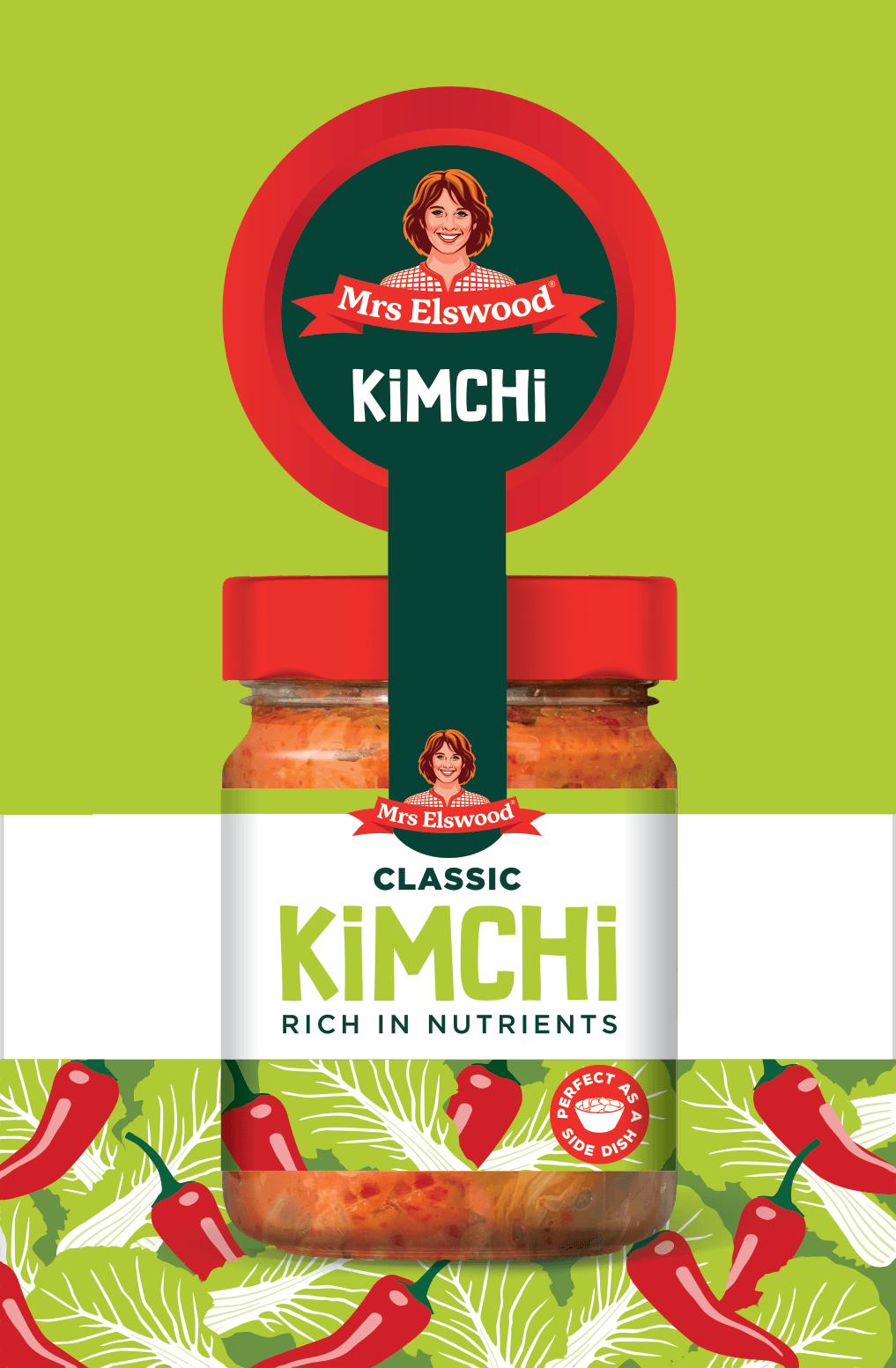
Simple icons were developed to communicate key product benefits quickly and improve visibility at the point of purchase.

Refining the Chosen Concept
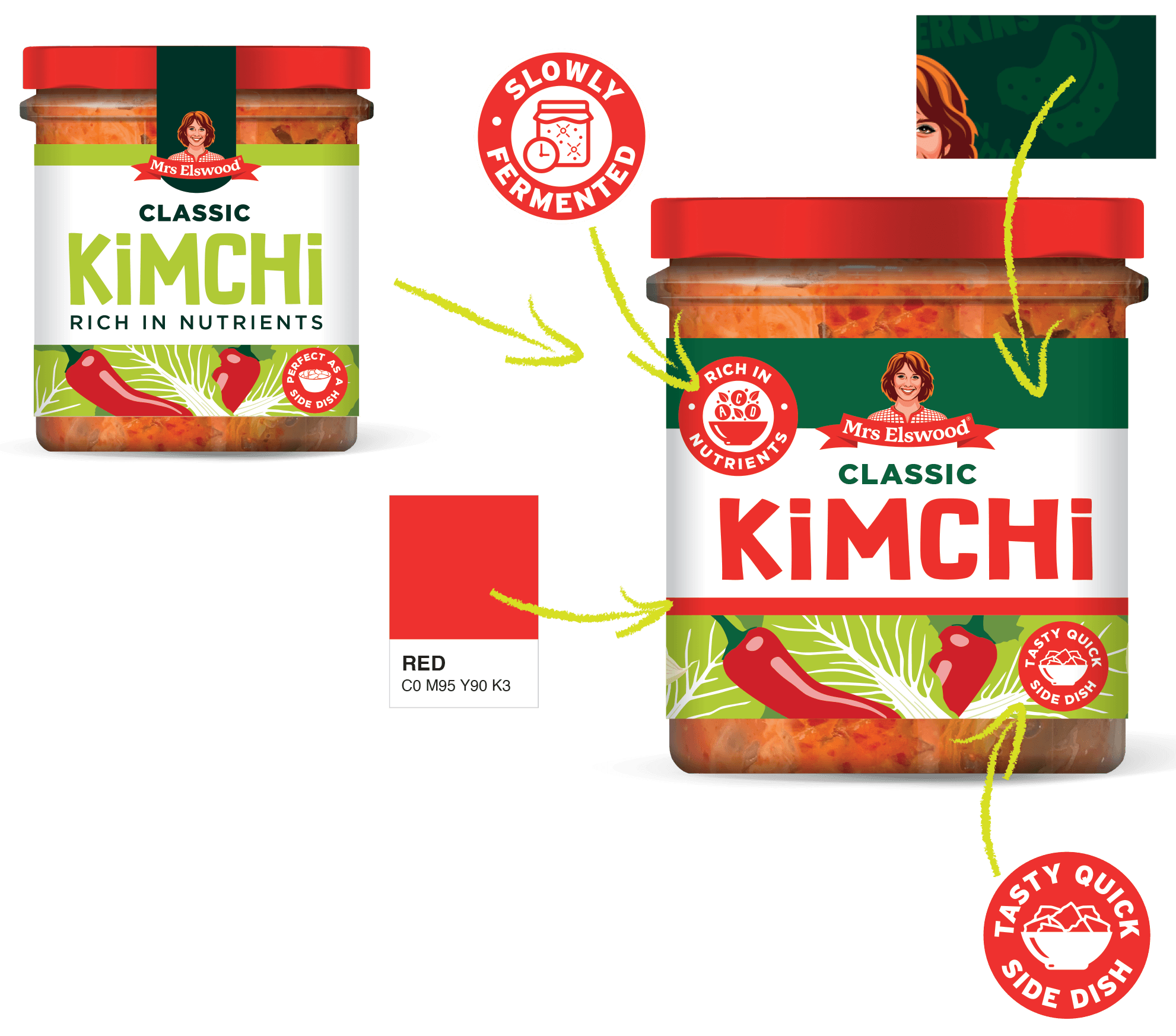
Following client feedback, the chosen concept was refined to accommodate a new jar shape, strengthen brand recognition through the logo treatment and increase on-shelf visibility with a more prominent product claim and enhanced flavour differentiation.
A lighter green palette was introduced to modernise the range while retaining brand recognition.
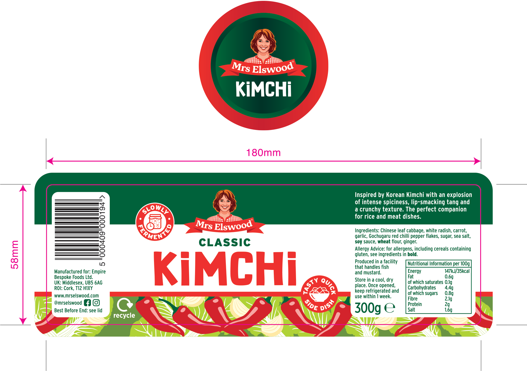
Full label & lid layout, artwork to the printers spec.
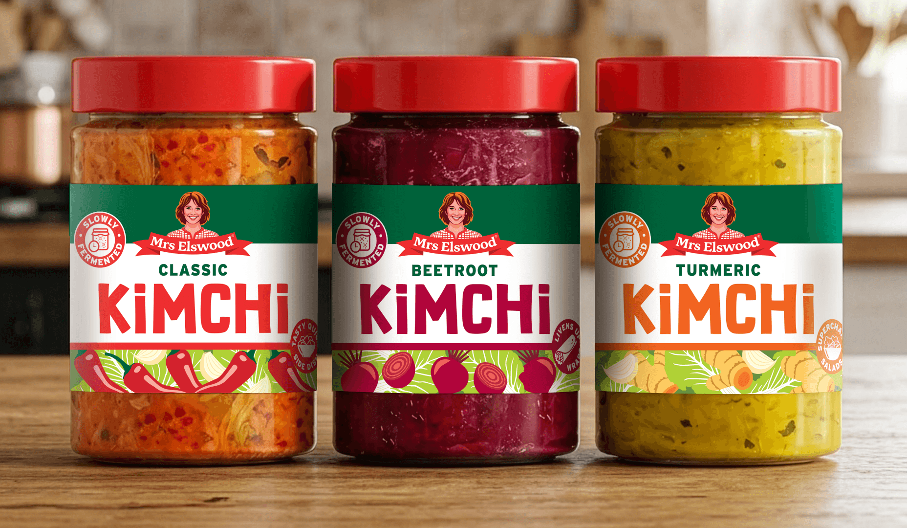
Final Packaging
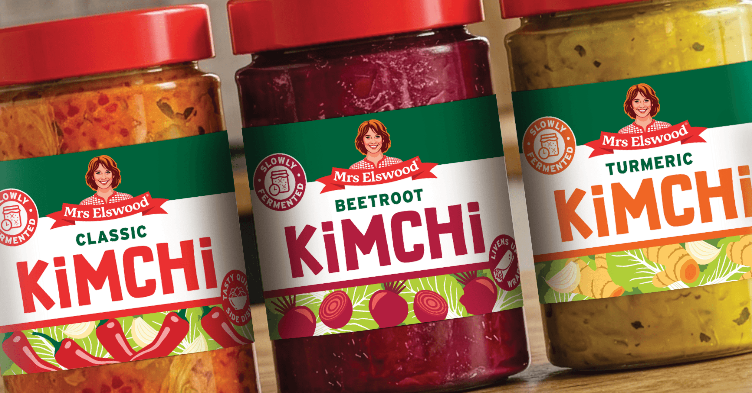
Bright, contemporary packaging using vibrant colourful illustration, playful type and clear iconography to communicate key product benefits. A consistent design across all three SKUs strengthened brand recognition while appealing to younger shoppers.
Have a project in mind? I'd love to hear about it.
·
Have a project in mind? I'd love to hear about it. ·
You may also be interested in…
WW Dal
Mrs Elswood Pickle Bites


Munch Co.
Nick Nairn