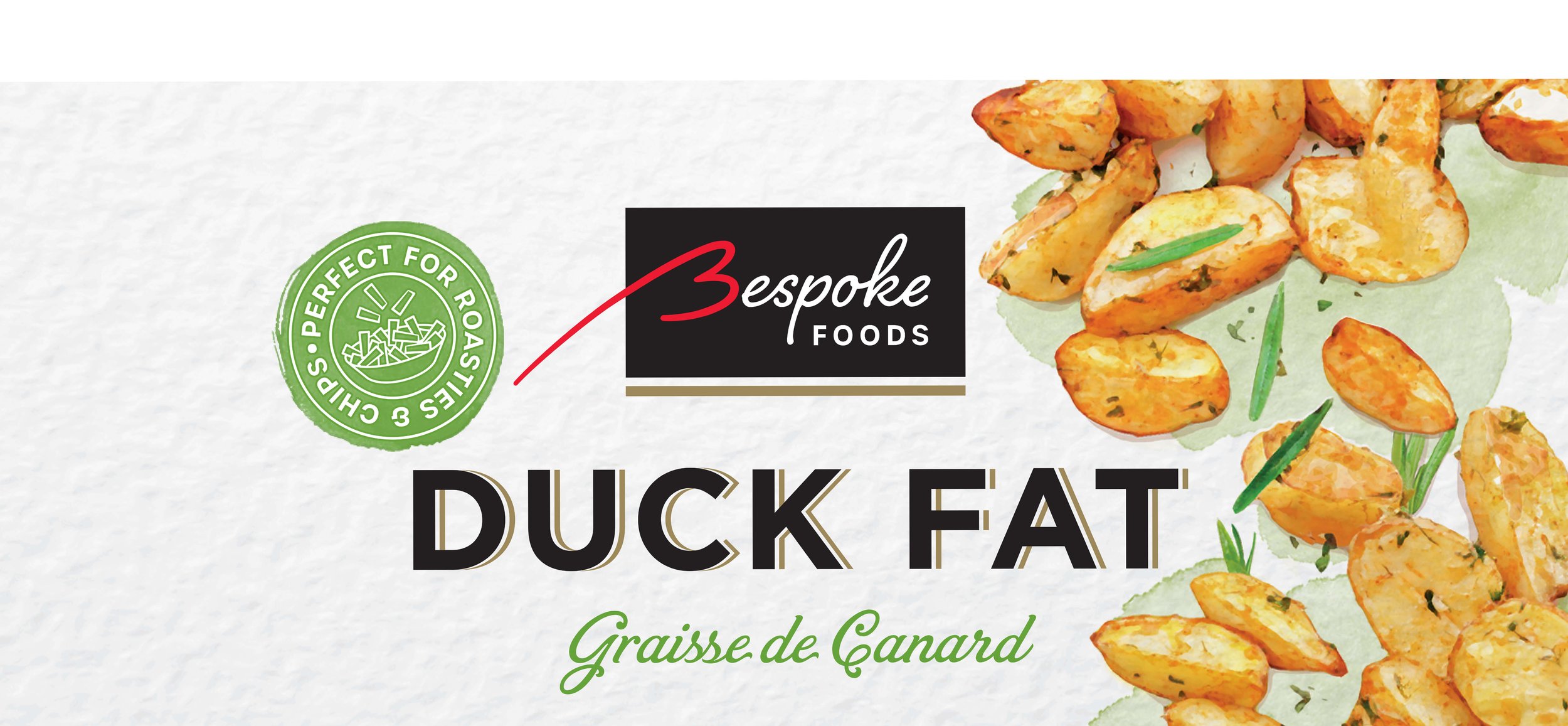
Packaging Design and Branding Case Study
Bespoke Foods
Client
Bespoke Foods
Sector
Food & Drink
Services
Logo Design
Packaging Design
Illustration
Print Artwork
Deliverables
2x SKUs
Brand Identity
Jar Label designs
Print Artwork
The Brief
Refresh the Bespoke Foods brand and redesign the French Duck Fat and Goose Fat packaging range, creating a more contemporary, premium look with stronger shelf appeal.
The Challenge
Determine whether any of the key elements of the existing packaging could be retained. A key objective was to establish a clearer visual hierarchy while creating a premium look that better reflected the quality of the products.
Brand Exploration
The project began with the creation of a new Bespoke Foods logo, followed by the development of the jar labels. From concept through to final artwork, I created a cohesive packaging design that strengthened the brand and elevated its premium positioning.
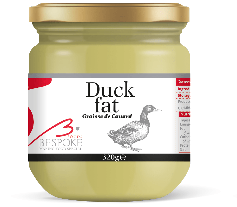
Original Branding
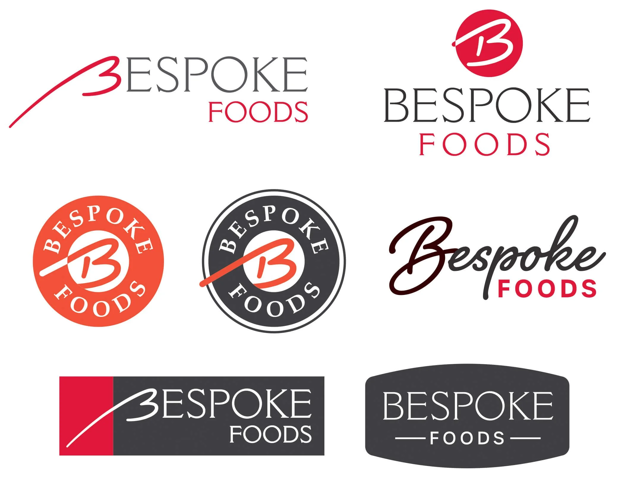
Logo Development
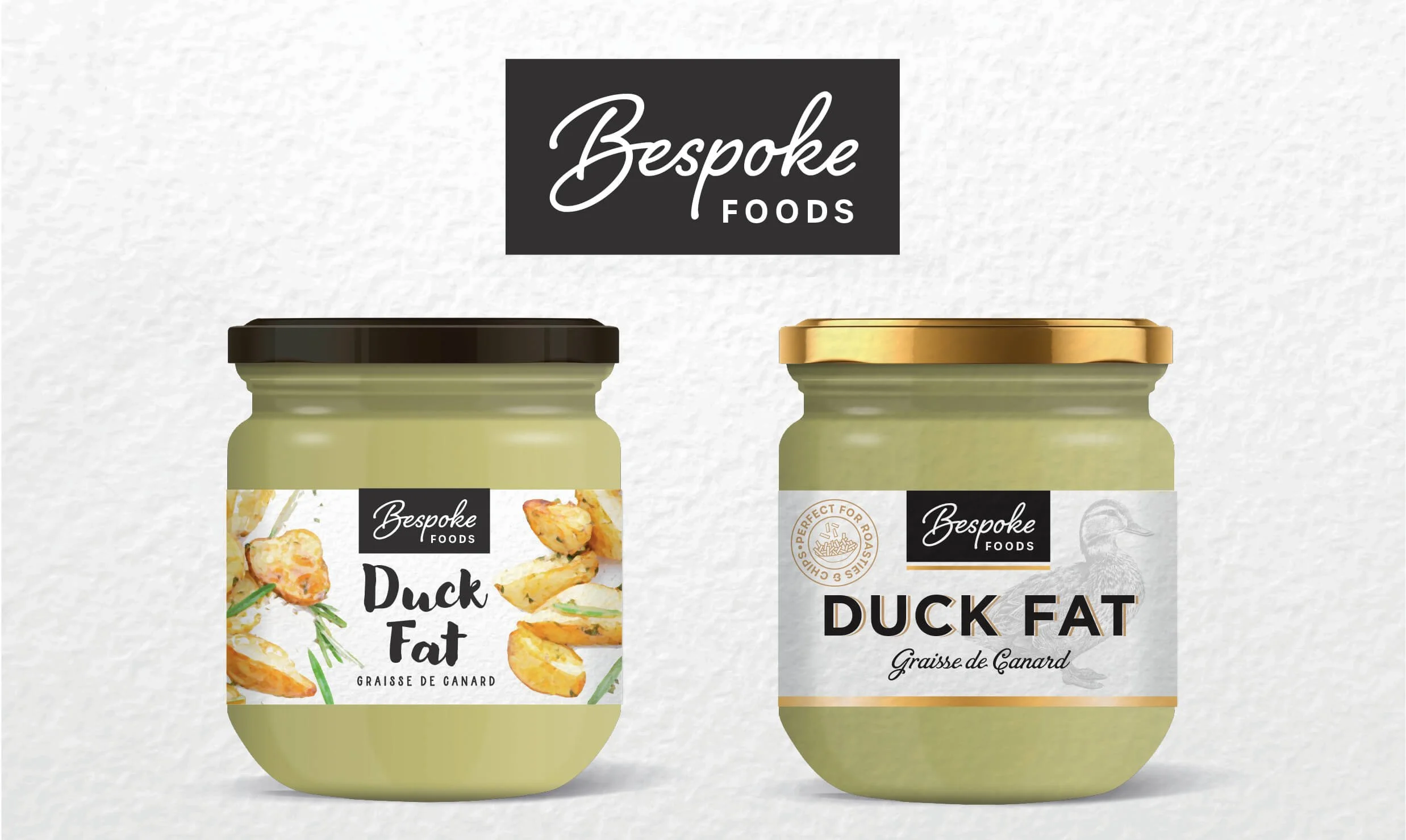
Design Options
Five creative directions were explored, experimenting with different approaches to colour, typography and illustration while drawing inspiration from French heritage and the premium positioning of the range.
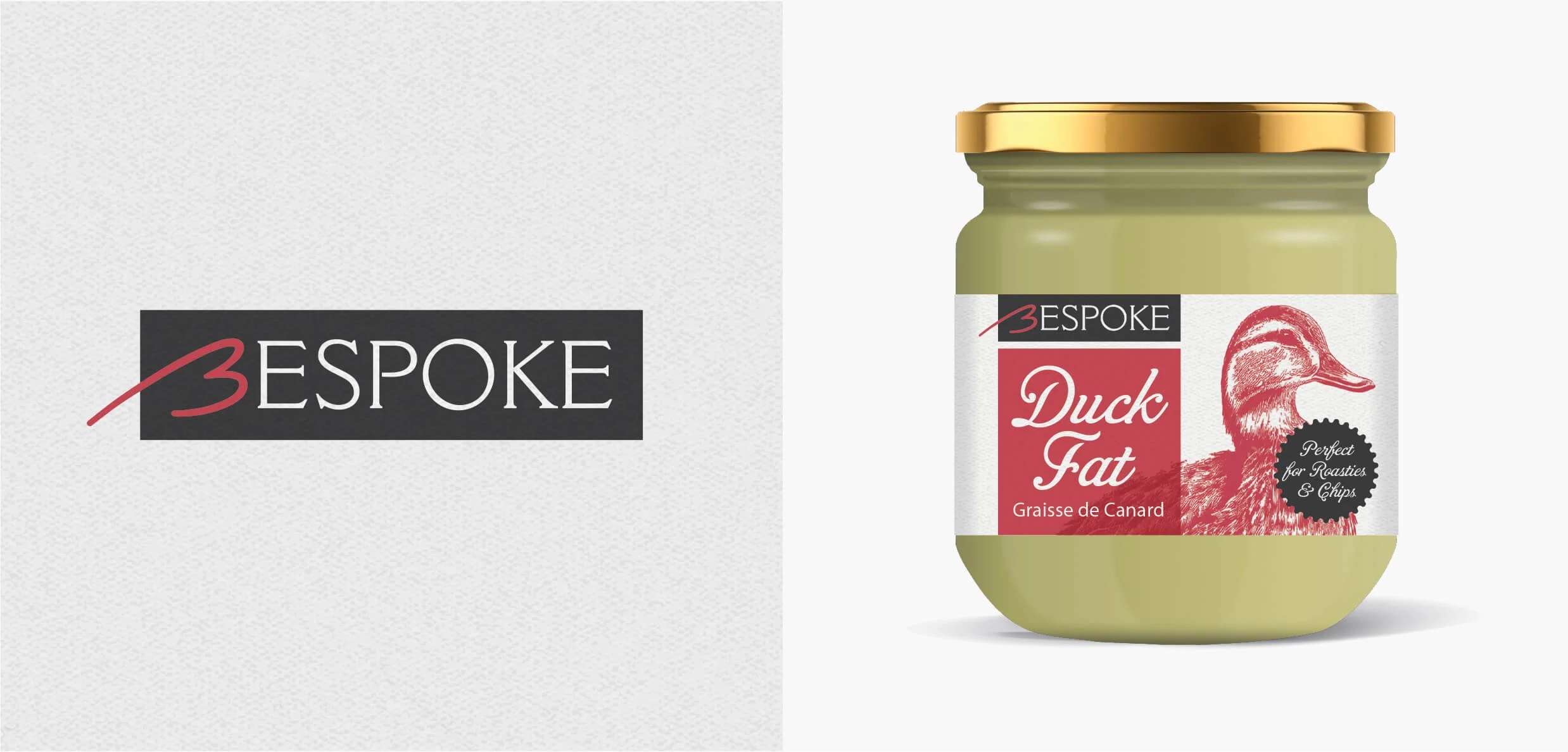
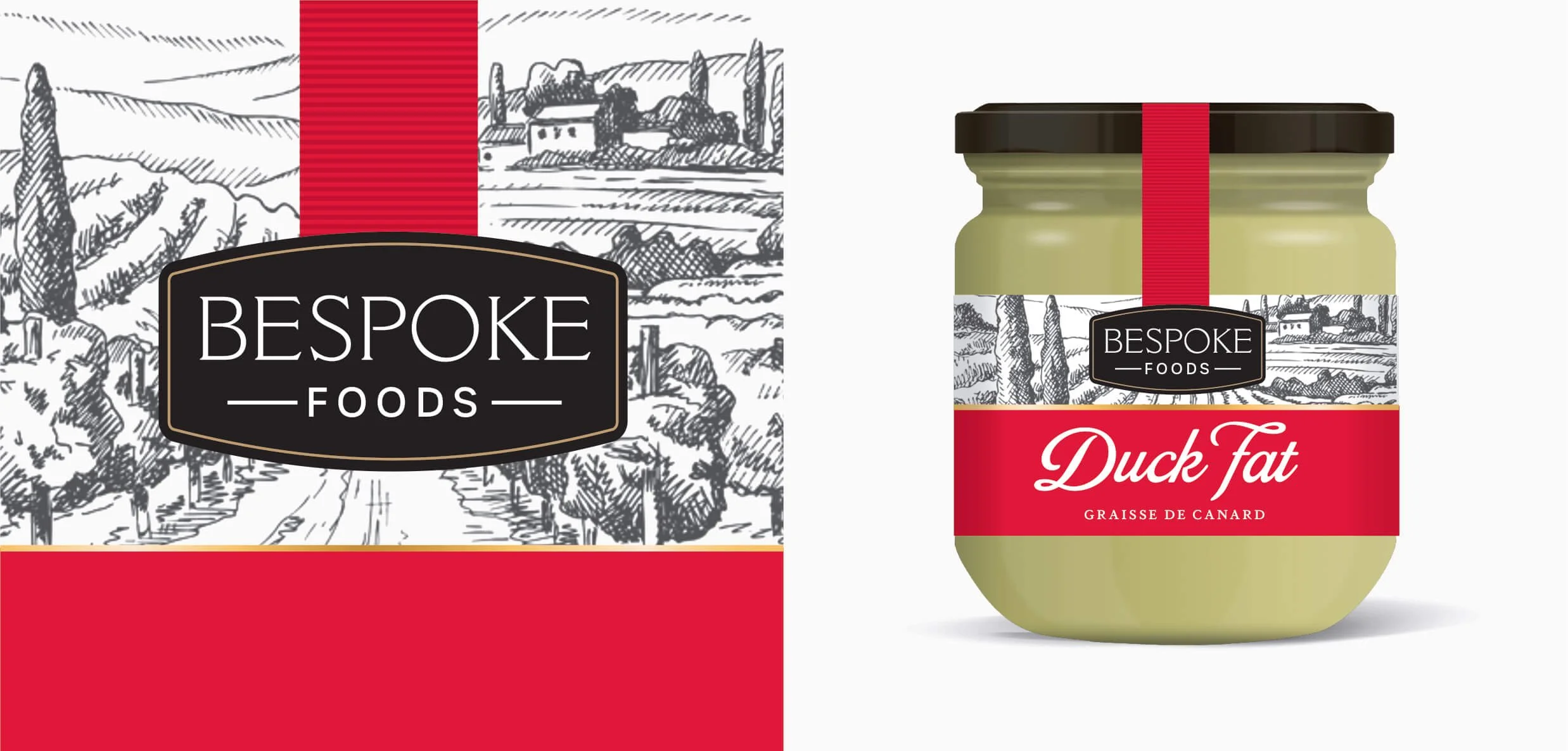
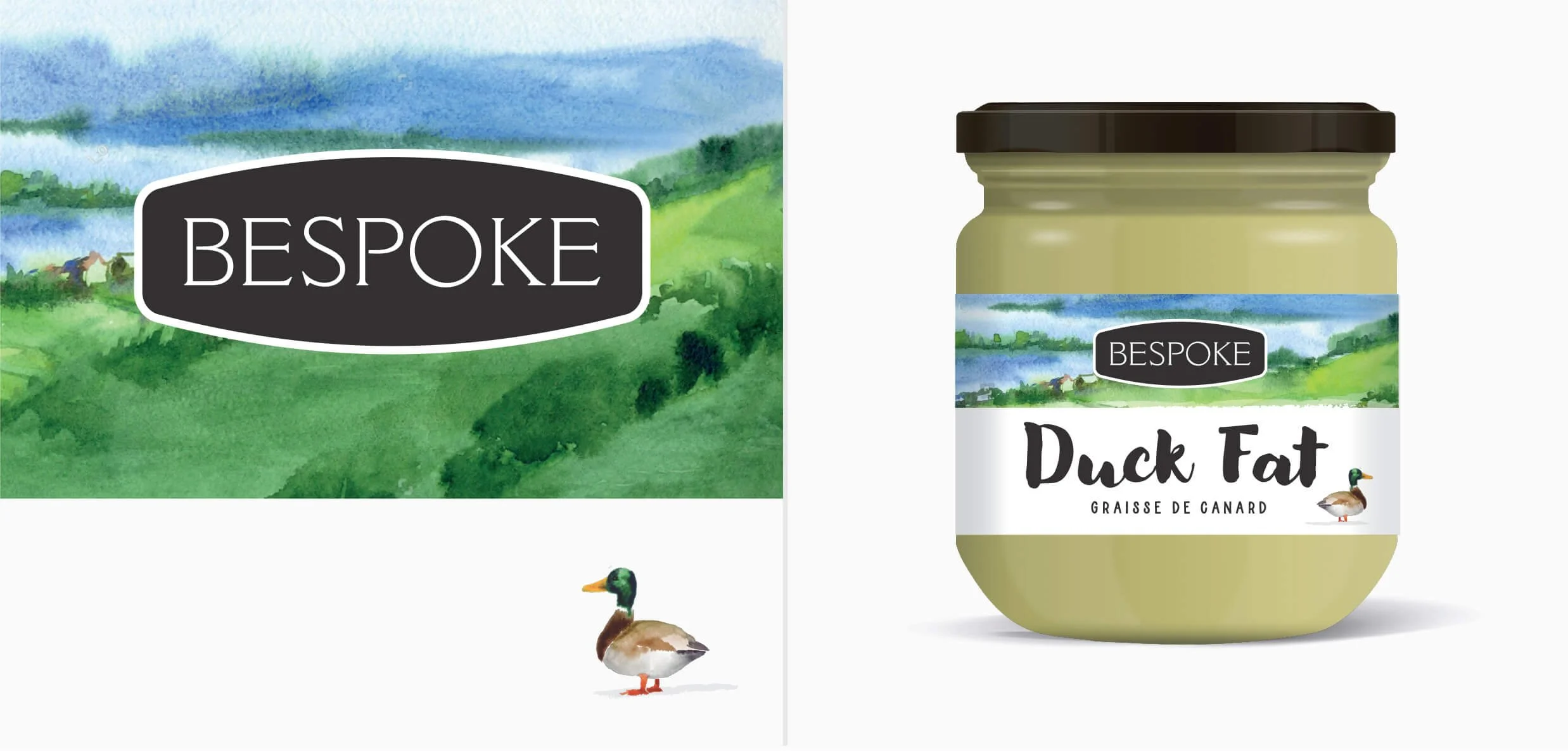
Design Development
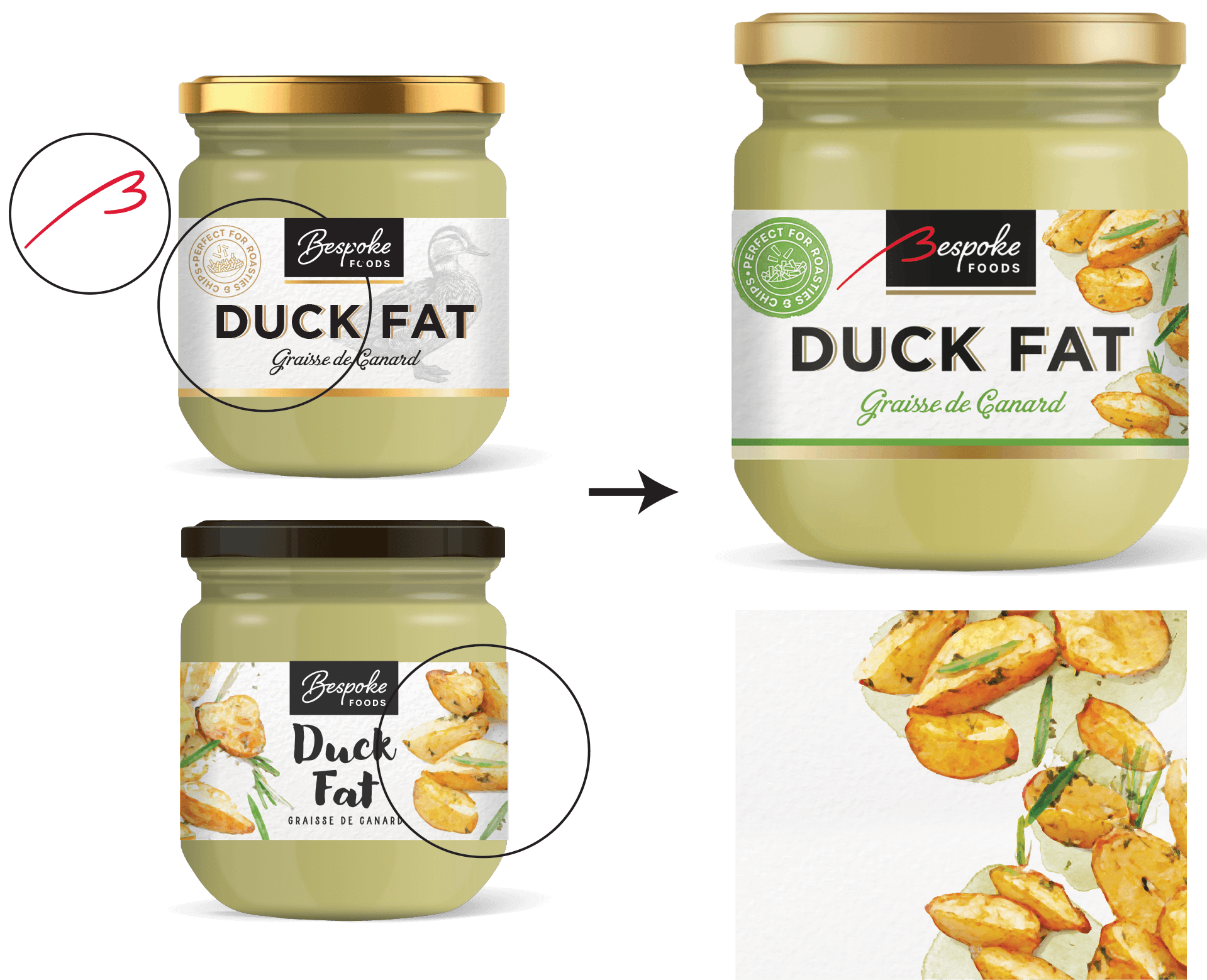
The design was refined following client and research group feedback including:
Merged two design concepts into one.
Evolved the logo by retaining the red 'B' from the original design to preserve brand recognition.
Increased the prominence of the key product claim, ‘Perfect for Roasties & Chips’
Created watercolour illustrations.
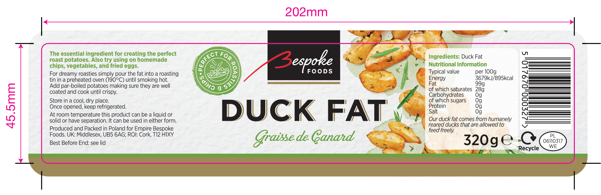
Produced final print-ready artwork.
Full label artwork
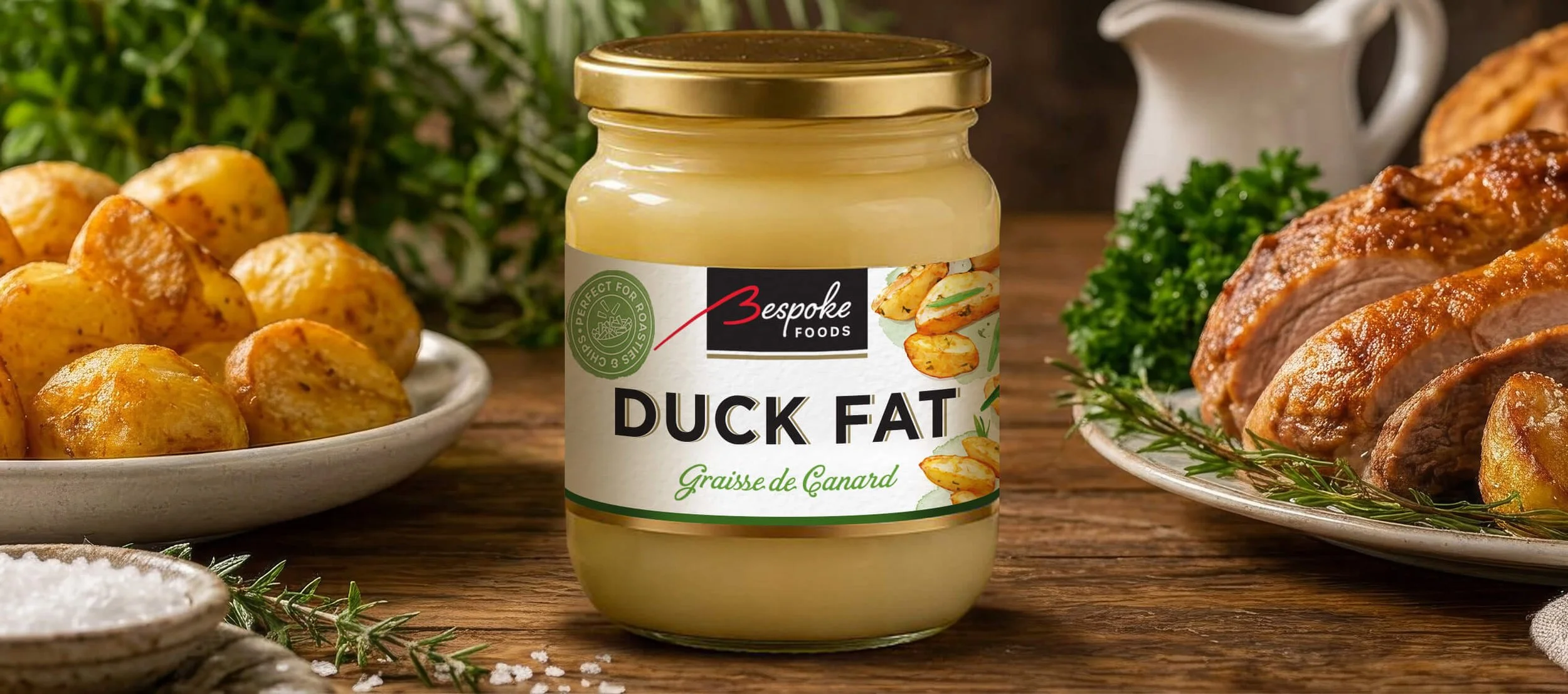
Final Packaging
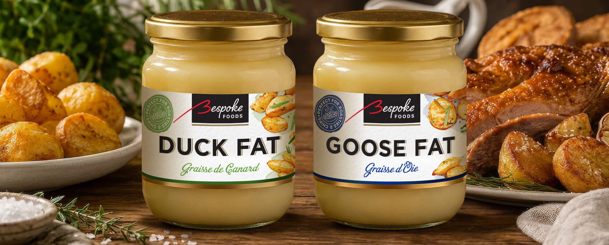
A contemporary premium packaging design with a clear visual hierarchy and stronger shelf presence, reflecting the quality of the Bespoke Foods brand.
Results
The redesigned packaging successfully elevated the Bespoke Foods brand with a more premium look, stronger shelf presence and improved product communication.
Have a project in mind? I'd love to hear about it.
·
Have a project in mind? I'd love to hear about it. ·
You may also be interested in…
Mrs Elswood Kimchi
WW Dal


WW Packaging
Chapstick